No descenders, thanks - we're Japanese!

"Pass the Bulldog sauce, Mum!"
I spend a lot of time looking at mixed Japanese/English text on the screen, and thus, perforce, at the results of using a Japanese font for Roman letters. Generally the result is dismally ugly.
How could that be? How could a country famous for its devotion to elegant calligraphy produce ugly writing? Well, the descenders have a lot to do with it.
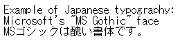
"Gothic" (actually goshikku) is the Japanese term approximately equivalent to sans-serif. It means that the character strokes have plain endings, without the serif-like lumps on a Mincho font, and the Roman letter part of the font will normally be a sans-serif face. The above probably looks quite legible (in small quantities), but after a bit it gets on one's nerves. I mean, look at the "typog" close up:
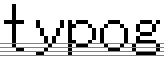
At this type size (notionally 12-point), the bowl of the 'p' has been raised above the baseline by one pixel, so that half of the stunted two-pixel descender is completely fake, being above the baseline. And no character goes more than one pixel below the baseline. How disgusting!
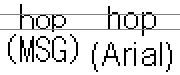
Now it is probably true that for maximum legibility in a restricted space, a relatively large x-height (in other words, short ascenders and descenders) is desirable. Here's the ubiquitous Arial, another present to the world from Microsoft, at the same notional point size:
![]()
Oh, but look closely! As the enlargement below shows, actually Arial has a slightly larger x-height; the Japanese font has gangly long ascenders, totally out of balance with the descenders. Two pixels (the extra on the Arial descenders) may not sound much, but it makes a huge difference to readability.
 And look at the default line spacing: it's no wonder that so many Japanese web pages seem hard to read because the text is just squashed too closely together. But let's turn for a moment to Japanese text, to understand where this aversion to descenders comes from.
* "...that traces its ancestry to China" |
Sample text, with the box surrounding each character.
Now when it comes to forcing these two entirely different sets of principles into a single document, something has to give. And it seems to be the descender that lost out. I suppose that by shrinking descenders to the same scale as the various strokes that seem to protrude from the bottom of kanji it was felt that everything might be seen as "sitting" on the same level.
Just to show that Bulldog sauce isn't an isolated example
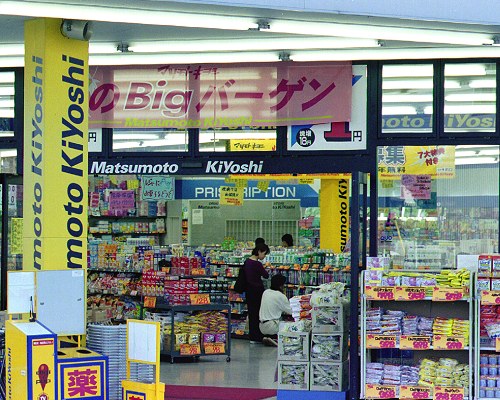
 One of the odder features of the current recessionary climate in Japan is that new chain stores - and drug stores in particular - are springing up like mushrooms. This on the left is the Matsumoto Kiyoshi chain, unusual in taking what I guess is the full name of the founder.
Matsumoto Kiyoshi website - while they didn't want anything to stick down and spoil the line of their smart Roman-letter logo, oddly the katakana version is plainly an imitation of Roman script, with ascenders, descenders and all. The following HTML fragment from this website makes it clear that the 'y' in Kiyoshi is intended to be lower-case: <img src="images/logo2.gif" width=288 height=28 alt="Matsumoto Kiyoshi">.
Another picture of the Matsumoto Kiyoshi store - ahem, they can't spell "prescription" either.
 Ah, someone's address...
Japanese search site www.goo.ne.jp
Part of the opening page...

And how do I know all this stuff about typography?
Simple! I have "Better Type" by Betty Binns, a book that explains it all, painstakingly. Sadly out of print, it's a large format hardback, containing well over a hundred samples of different settings of the same piece of body text (from "Clayhanger" by Arnold Bennett). After explaining all the basic terminology, she takes us on an amazing journey, showing how the basic issues of readability and "type colour" (the textural appearance of the page) are affected by the style and size of typeface, and by the line spacing. In particular she shows the different effects of faces with small and large x-heights, regardless of the basic type size. This journey ends with a flourish of details: I confess I really had not realised there were so many possibilities to consider in setting fractions, for example.
An excellent book. Originally $30, mine has a Strand Bookstore remaindered price tag of $4.95.
I recommend you find a used copy through ABE
The title of this page is inspired (if I may go over the top for a moment) by the farce "No Sex Please, We're British" which defied its feeble title to run in the West End of London from 1971 to 1987 - the record for a comedy. (See Digiguide)